Master Bedroom and Bathroom Remodel Before and After
I’m finally sharing another before and after today!! We are headed into the master suite for all the fun details on our bedroom and bathroom remodel. If you missed the kitchen remodel you can check that out here!
To catch you up on the back story of our renovation journey we purchased this home as a foreclosure when we moved here and over the span of living in it we’ve remodeled each space! I’ll be sharing more details on the rest of the house soon. Sadly we will be leaving this house in July for another adventure, however, we’ve chosen to rent the home so that we will have the option to come back someday down the road!
Are you ready for this bedroom and bathroom remodel?
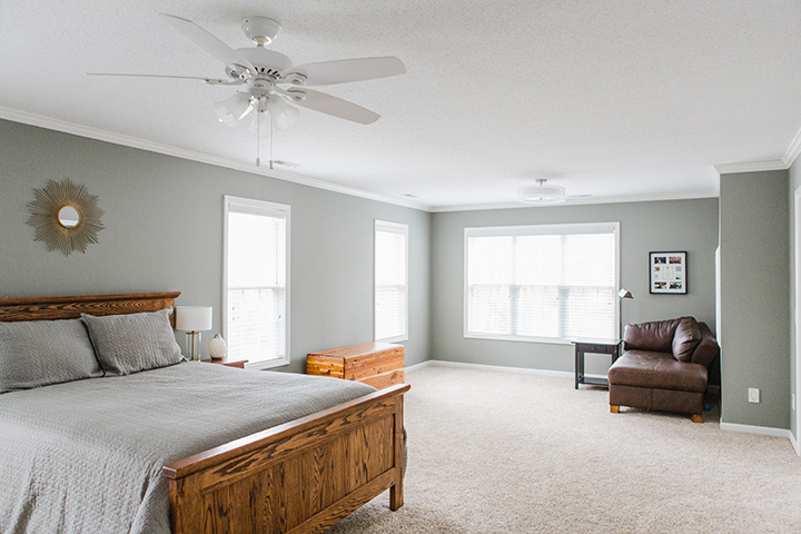
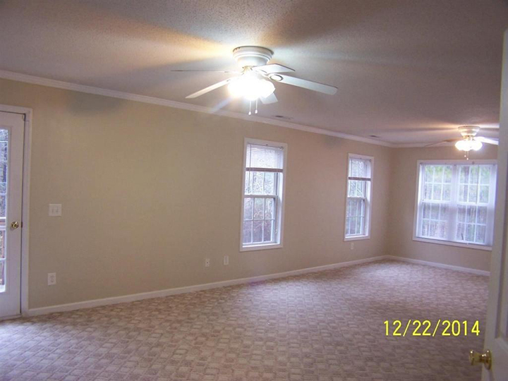
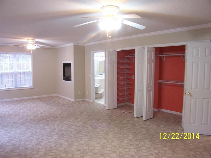
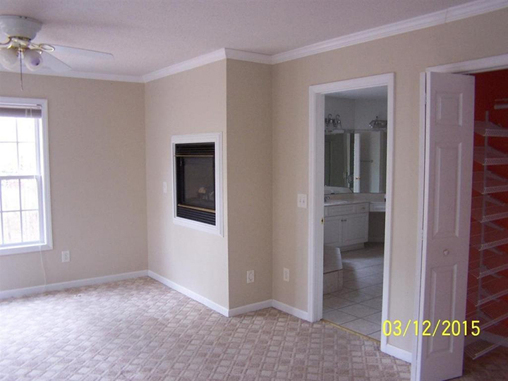
When I first laid eyes on this room I was grossed out by the paint colors, dirty carpet, and the outdated design. The tub had old bugs and dirt, there were dust and cobwebs hanging around, and the thought of converting this room into something livable seemed challenging.
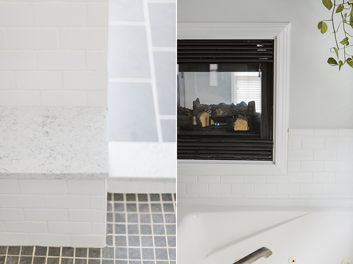
What sold me was that dual-room fireplace! I just imagined cold winter nights cozy in bed with the fire on or evening baths soaking in that jet tub. At this point, we had never done any major remodeling to a home before and I had to be willing to temporarily live with the state of the home during the renovation process. My first response to the home was to pass it up, but I knew my husband was excited about it and it really did have so much potential. Now, I’m certainly glad we decided to go for it but it was a lot of hard work. Living in a home while renovating is not easy. A lot of dusting is involved!
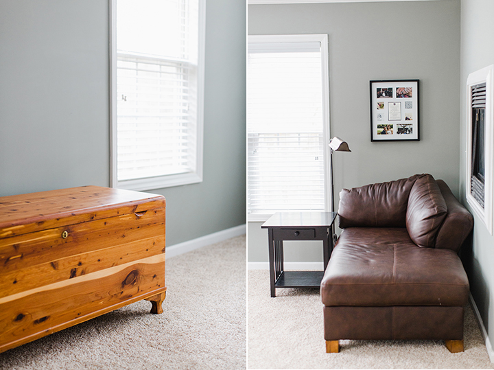
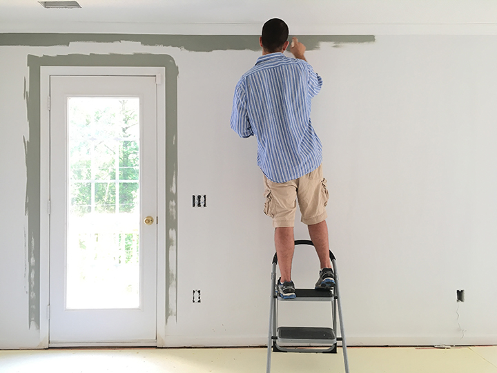
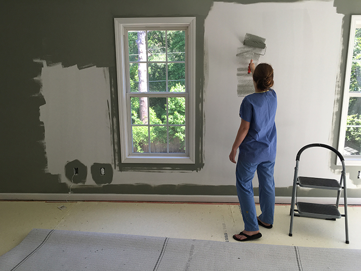
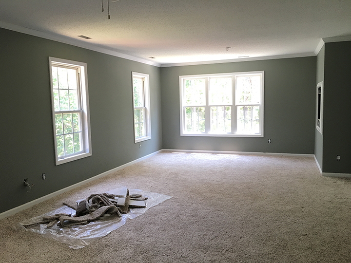
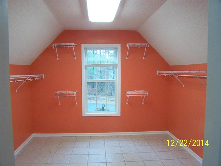
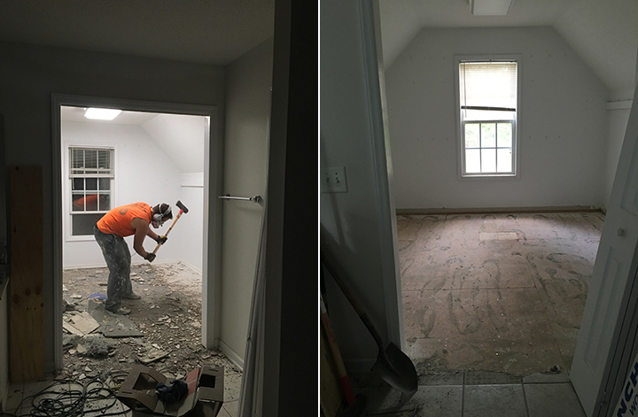
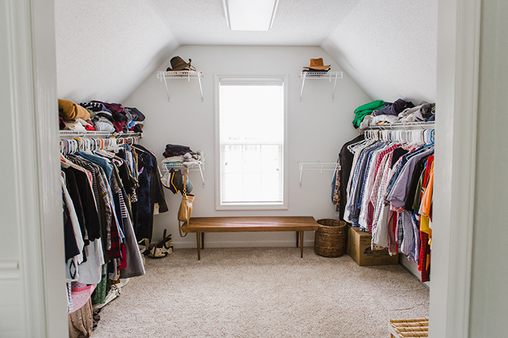
For this project, we ripped out the carpet before we even moved our belongings into the house. We were also able to paint the bedroom before the official move. We tore up the tile in the bathroom closet so that once the new carpet came we could have it laid in that room as well. Nothing else was done to the master bathroom (other than some major TLC) for another year as other house projects took priority.
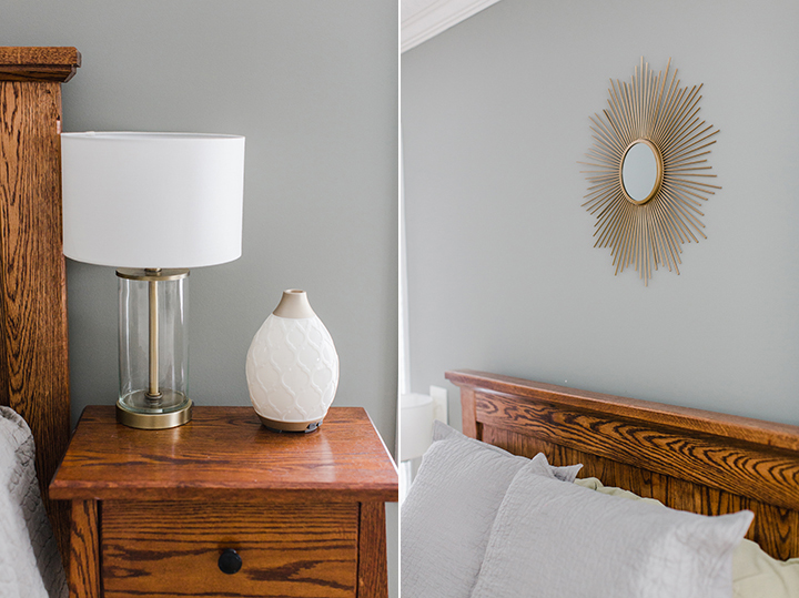
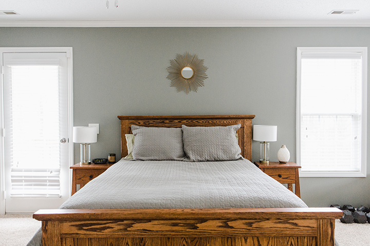
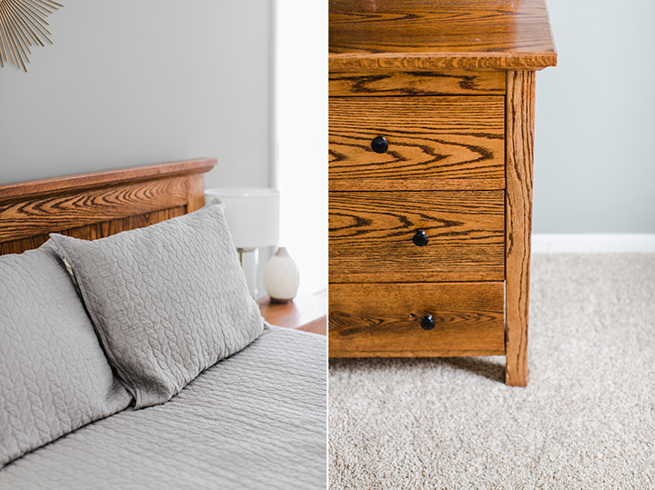
I’ve opted to keep the decor fairly simple because I knew that as we move frequently we don’t often have this much space for our belongings. I didn’t want to buy extra decor for the walls just to struggle to find space for it in a smaller home down the road. I also love to decorate my home with very personal items and prefer to gather items over time with special meaning. With that, we kept some special pieces, purged items that we didn’t love anymore, and filled in the gaps where needed. I love the simplicity and tranquil nature of the room.
Also, I just wanted to mention that we went for a darker wall color than I would normally choose just because the room was so big we thought that it allowed for a more bold hue without making the space feel small. We took a risk on a color we never even really sampled and I’m so happy with how it turned out!
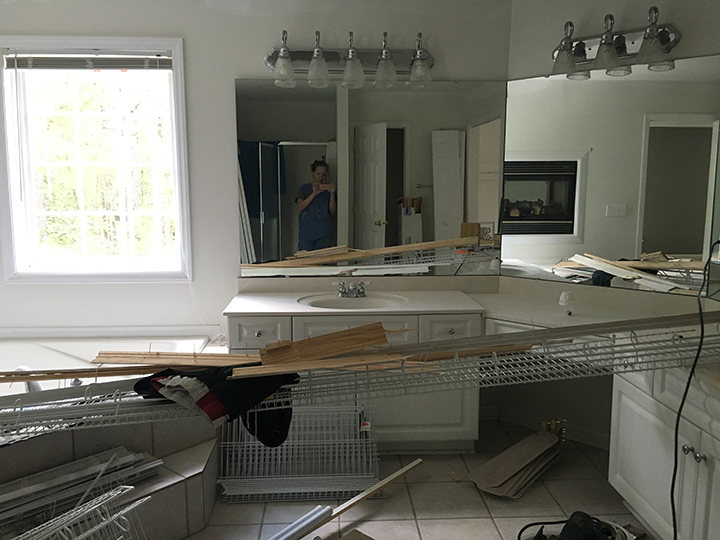
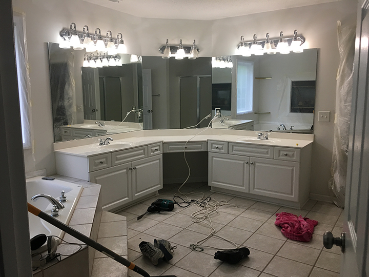
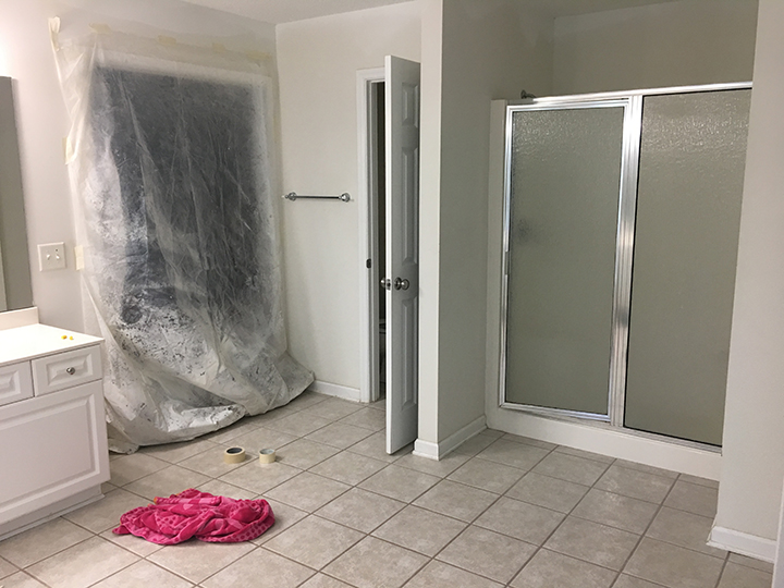
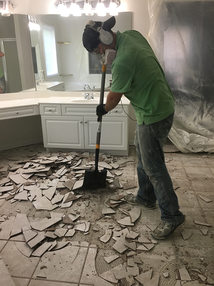
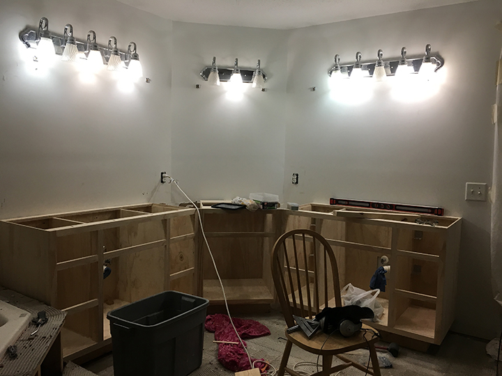
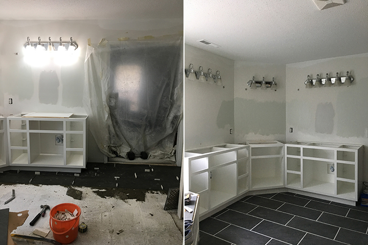
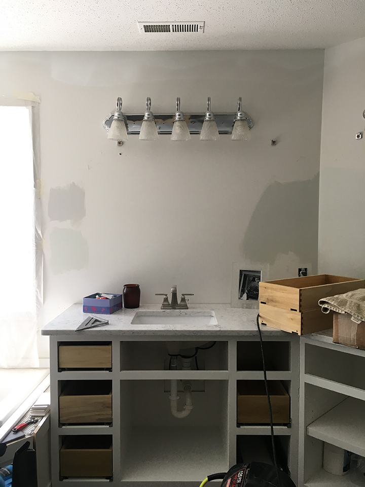
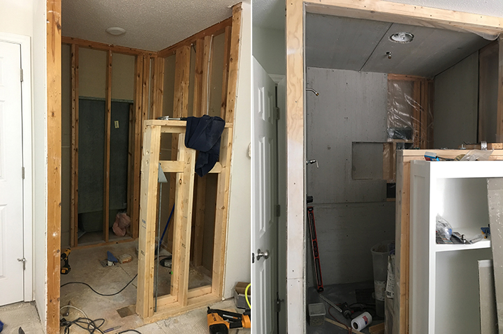
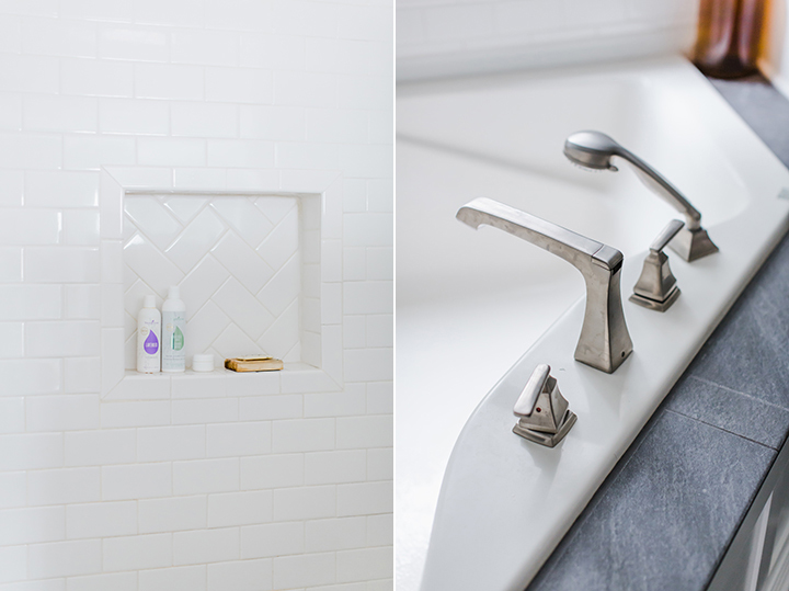
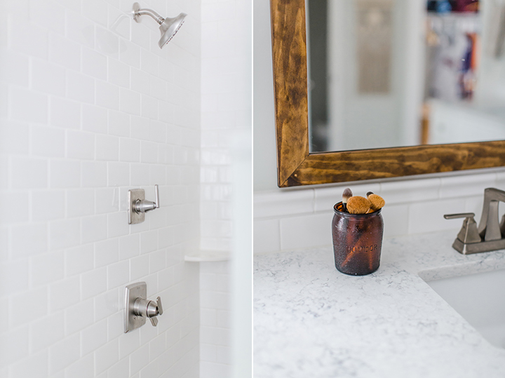
I think the biggest transformation in this house is the master bathroom remodel. This was one room that we added some wall framing and reconfigured the cabinets to bring in more functional storage to the large space. We removed the shower insert, reframed the shower to a larger walk-in space, added a bench, custom tile, and glass doors. We also added a white subway tile backsplash that carried around the tub. The vanity had a middle area for sitting however we closed it off and added shelves and created a custom cabinet on top of the counter for additional storage. I also love the refreshing color we chose and I’m sure that it will be one that I use again in another home!
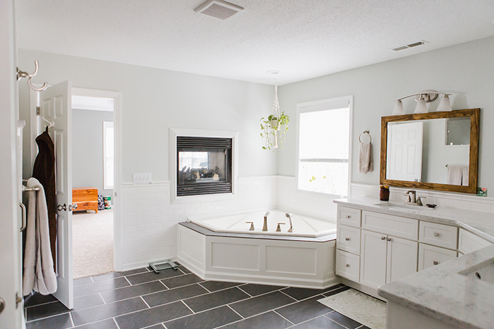
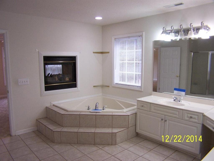
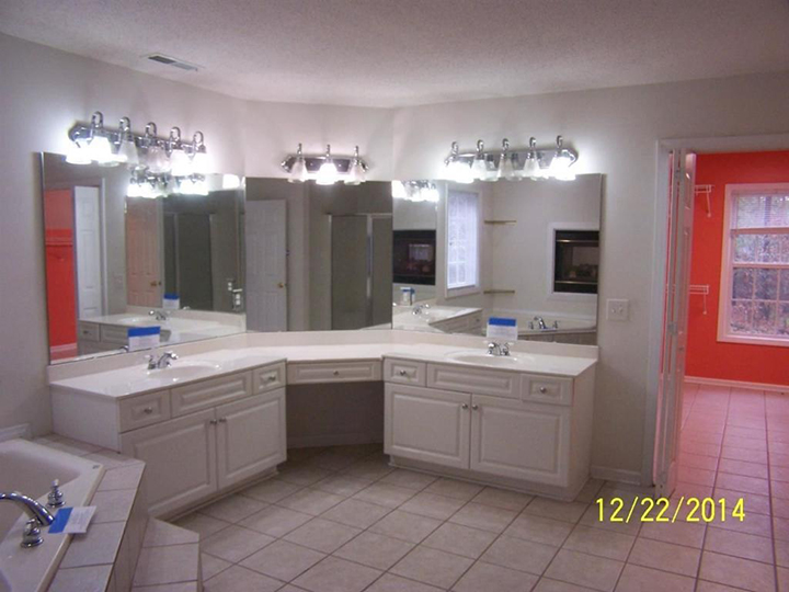
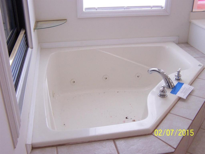
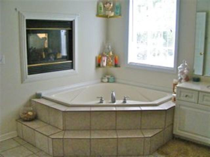
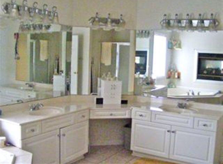
I included some listing photos from when we bought the house but I also found some old photos online from when someone lived here! Sometimes I just don’t understand what people were thinking! I’m loving how bright and airy the bathroom is now with some timelines elements. One thing we chose not to do was to replace the tub. For our budget, it worked best to keep the existing tub. I thought about painting it but was nervous I would do more harm than good. There is a process for refinishing tubs however we opted to leave it as is and I don’t really notice that it’s more creamy than the rest of the room.
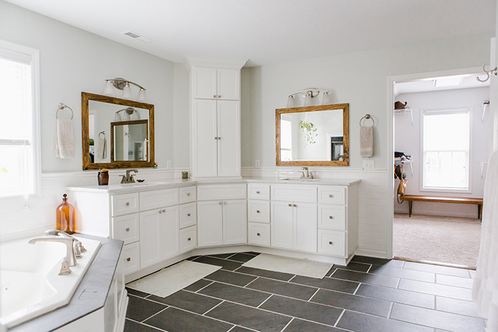
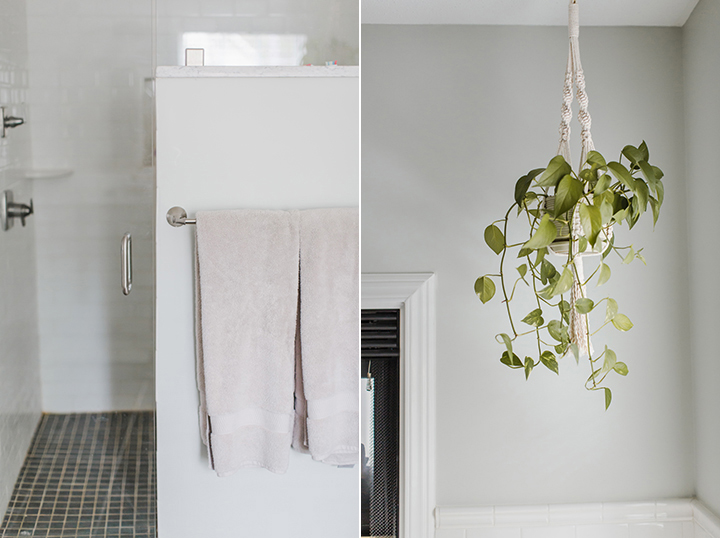
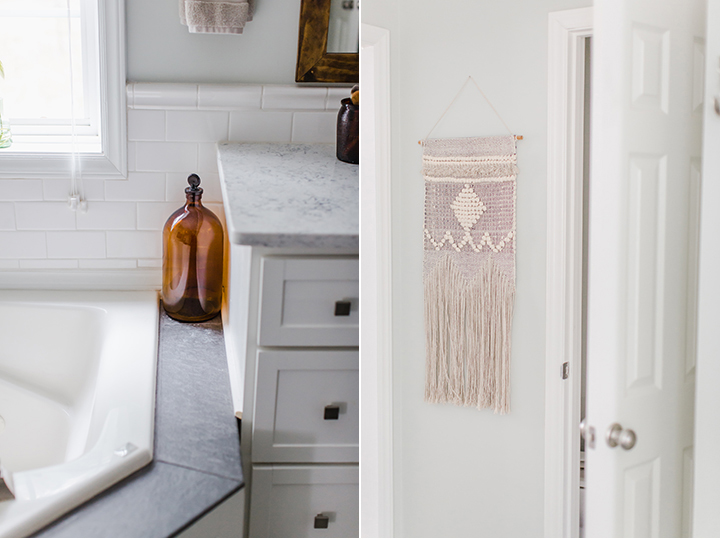
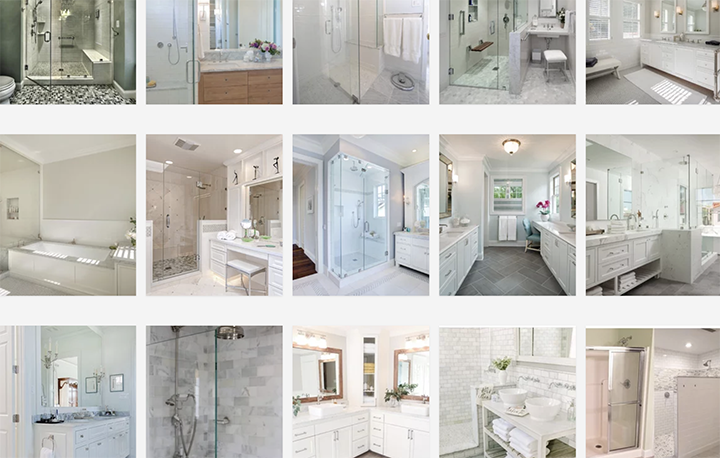
Here are some inspirational images from our Houzz ideabook where we dreamed up how we wanted this master bathroom remodel to look and function.
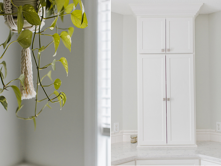
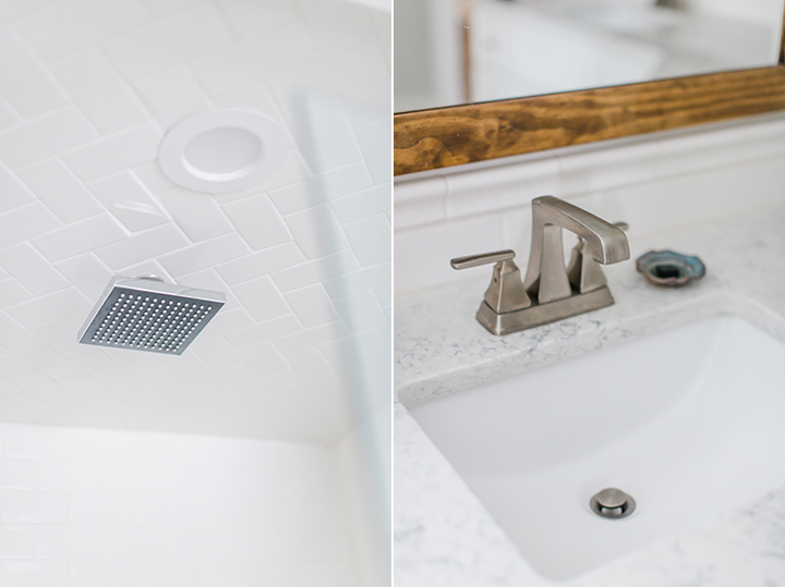
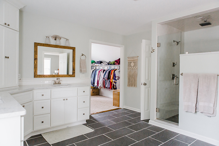
I’m sure you can see how it will be so hard to leave this little slice of heaven! I hope this process was an inspiration to you for your next home project! Stop back here for more of our home remodel projects!
Disclaimer: In the name of full transparency, please be aware that this blog post contains affiliate links and any purchases made through such links will result in a
small commission for me (at no extra cost for you). As always I appreciate your support by using my links!
- Bedroom Wall Paint: Valspar Gray Expose
- Bathroom Wall Paint: Valspar Stony Path
- Cabinet and Trim Paint: Benjamin Moore White Dove
- Granite: Italian Waves Quartz
- Tile: White Subway Tile Lowe’s
- Grout: White
- Gold Sun Wall Art: Hobby Lobby
- Nightstand Lamps: Target
- Bedroom Furniture: DIY by my husband
- Bedding: West Elm (only available as a quilt, duvet not available)
- Drum Light: Wayfair (similar)
- Diffuser: Young Living
- Candle: Oak and Oliver
- Vanity Lighting: Lowe’s Portfolio Lyndsay
- Vanity Faucet: Delta Ashlyn
- Tub Faucet: Delta Ashlyn
- Shower Head and Handle Set: Delta Ashlyn
- Rainshower Head: Delta
- Towel Bar: Delta Ashlyn
- Towel Ring: Delta Ashlyn
- Rob Hook: Delta Ashlyn
- Toilet Paper Holder: Delta Ashlyn
- Cabinet Knobs: Wayfair
- Mirrors: Custom by my Husband
- Floor Rugs: Target (similar)
- Macrame Plant Hanger: Mosshound Designs
- Macrame Wall Hanging: Hobby Lobby (similar)
- Amber Glass Jars: Thrifted
