Interior Paint Colors That Flow From Room to Room
I’m not sure if I wanted to write this post more for myself or for my readers! I’m sure that I’m not alone when you show up to the hardware store wondering what color was that wall again. I’m making a mental note of all our interior paint colors for this very moment.
Our move date is quickly approaching and we are working on so many little house projects that need to get done before the moving truck drives away. I’ve loved this first big renovation project and as our first baby fixer-upper is nearly complete I’m making sure I have all the resources tucked away for easy reference down the road.
I love seeing before and after photos of home renovation projects but a lot of times you only get to see just one room.
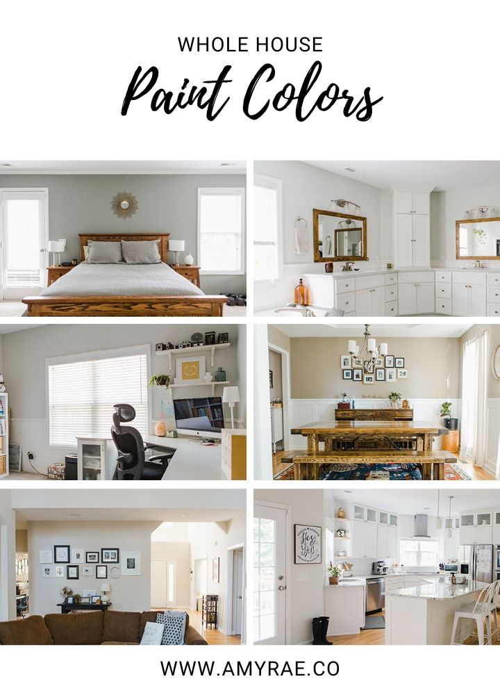
When making style and design choices it is helpful to see how each room color flows into the next and how the whole house is cohesive in its esthetic.
For this post, I’m sharing nearly every room in the home and the specific interior paint colors we chose. It is so helpful to see all the rooms together and the overall color palette of the home.
Cabinets and Trim: White Dove by Benjamin Moore
Walls: September Fog by Valspar
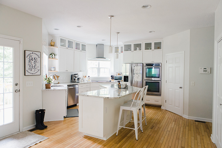
The first room I will share is the kitchen! We went with White Dove by Benjamin Moore for the cabinets and the trim. For reference, this same color is used throughout the home on all the cabinetry, doors, and trim. The color is a beautiful creamy white and we upgraded to a premium paint for overall durability.
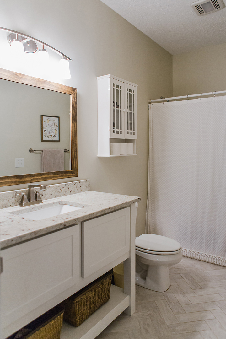
The kitchen walls are September Fog by Valspar. I personally love this color in our kitchen. It’s a creamy off-white and is a simple warm transition from the white subway tile and cabinets. The colonial white granite plays so well with this color. I will say, however, we did have to purchase additional paint of this color and Valspar had to change the name of the color for some reason and in the process, I feel like the color was not quite the same. We used it in a bathroom as well as in the main living area in our beach house and I feel it took on a more yellow tone. I’m not sure if it happened after the name change or I’m just seeing it differently in the different rooms/lighting so keep this in mind.
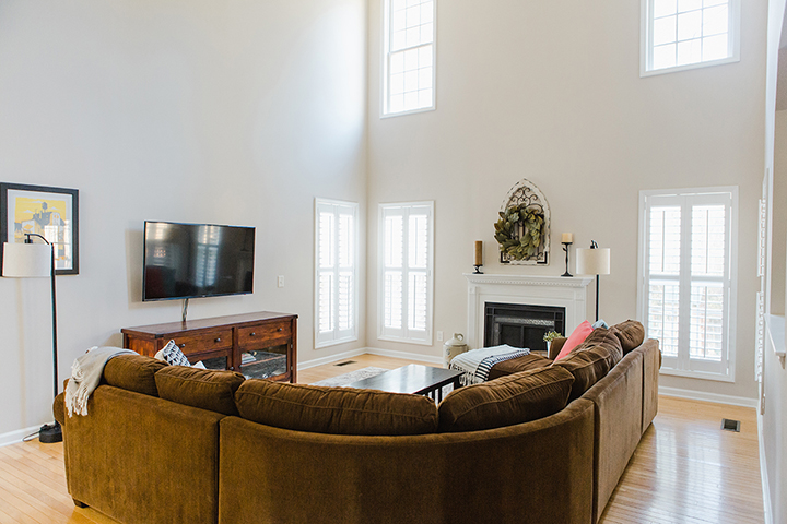
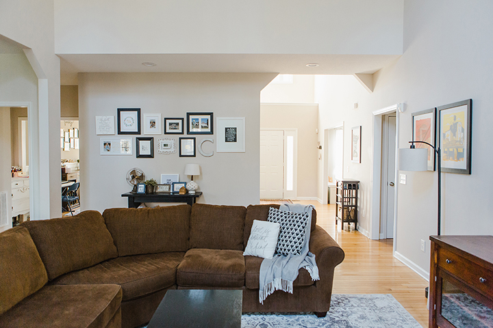
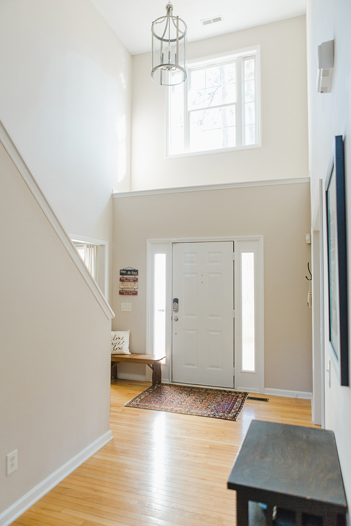
Cedar Key by Benjamin Moore
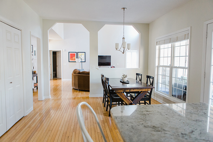
The main living area downstairs including the two-story entry and open upstairs walkway area is painted Cedar Key by Benjamin Moore.
We wanted a warmer tone that a very light brown/tan with hints of gray. This color was a perfect neutral so it worked throughout this large space.
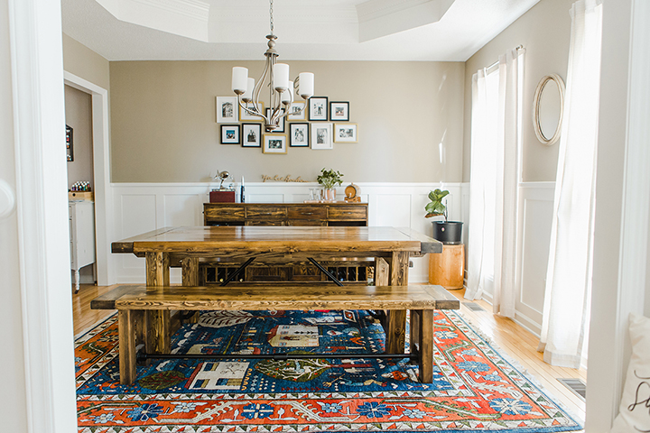
Indian River by Benjamin Moore
The formal dining room was Indian River by Benjamin Moore. I believe we actually color matched this at Lowe’s Home Improvement in the Valspar brand however this color was our inspiration and it’s right on. I loved the depth and warmth of this brown in contrast with the board and batten trim (painted in White Dove by Benjamin Moore).
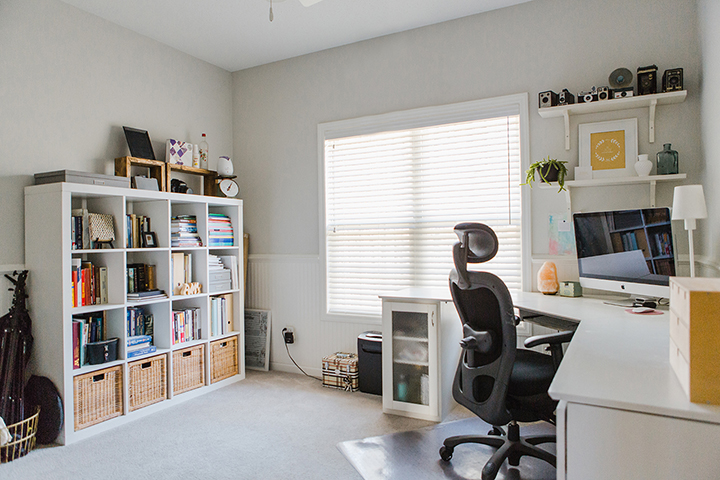
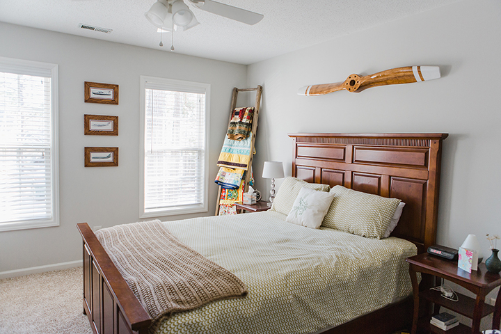
Tempered Gray by Valspar
The office has wainscotting which is painted with White Dove by Benjamin Moore and the walls are painted Tempered Gray by Valspar. I first fell in love with this perfect light gray when we were living in our last house and I knew I wanted to do it again in my office once we moved. It is the most absolute perfect gray and I have now painted it in several rooms in multiple houses and it’s so consistent!
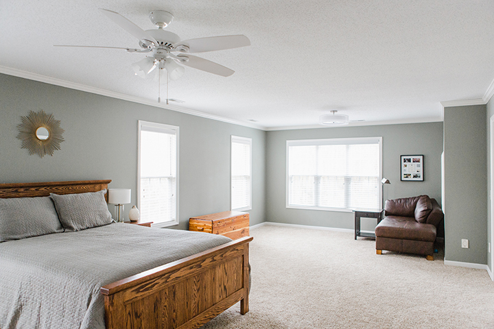
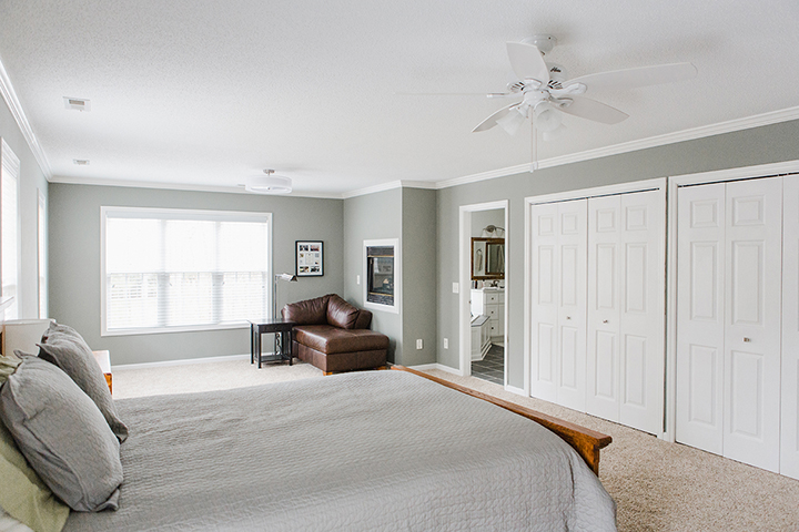
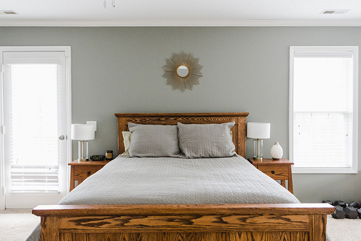
Gray Expose by Valspar
Heading upstairs the master bedroom color is Gray Expose by Valspar. We took a risk with this one without even sampling it. The room is so large with a lot of natural light that we figured a bold color would be a fun option without making the room seem small. It’s a great medium gray with a more cool/green undertone.
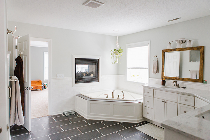
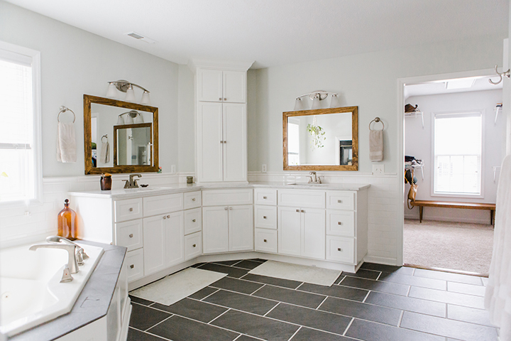
Stony Path by Valspar
As we transition into the master bathroom the walls are painted a very light gray/green color called Stony Path by Valspar. I wanted to bring in the green/gray tones from the master bedroom but on a lighter and tranquil note. This soft sage gray color is perfect.
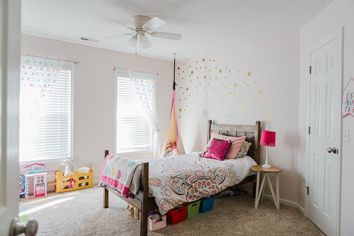
Seashore Bud by Valspar
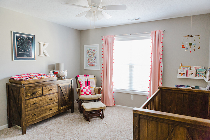
Our daughter requested a pink room and we made sure it was a simple and sweet pink color that we didn’t shun away from when we entered the room. It’s a color I don’t mind at all and isn’t over-the-top pink but still satisfying for a little girl. We went with a warm pink called Seashore Bud by Valspar for her room.
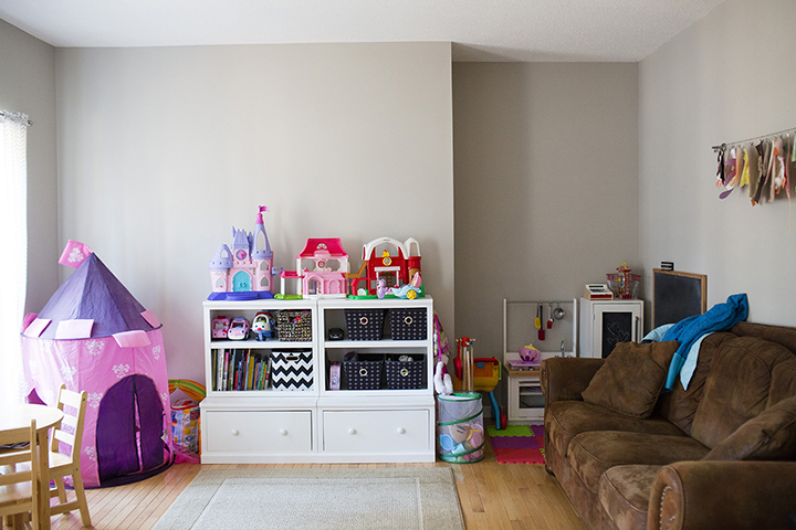
Frappe by Valspar
My husband prefers the idea of having no more than two rooms the same color. So when it came time to paint the playroom and our other daughters’ room it was time for a new color. It started getting challenging to find a color that worked for the type of room, matched the decor, and still flowed with the rest of the house. We went with Frappe by Valspar and it’s a happy medium brown/gray that can work with both the warm and cool tones of the house.
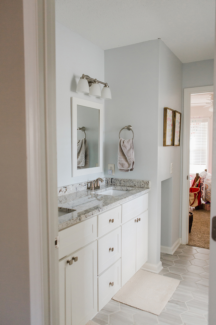
Sheer Light by Valspar
Finally, the shared bathroom in the kids’ rooms and the ensuite in the guest room are both the same color. I wanted to go with a cooler gray tone without being too similar to any of the rooms they were within. Personally I would have just gone with the Tempered Gray again to be safe however my husband wanted something different. So we went with Sheer Light by Valspar without testing it. My husband painted both bathrooms when I was out of town and when I came back I wasn’t happy with how blue the color really was. At the time it wasn’t worth the extra effort to repaint but maybe someday we will. I can totally live with it and it’s actually not a bad color but not quite what I was going for.
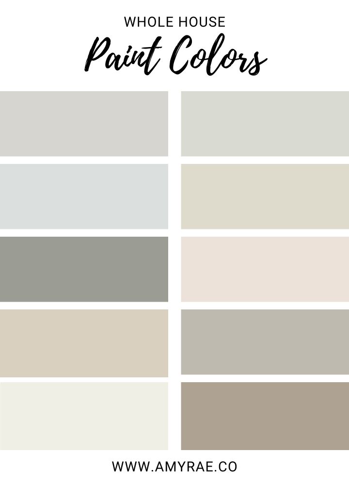
I’d love to hear if you’ve been inspired by any of these interior paint colors for your home! Let me know in the comments if you try any of these colors!
Want to see full before and after photos of our kitchen and master suite remodel? Check out these posts!

One Comment